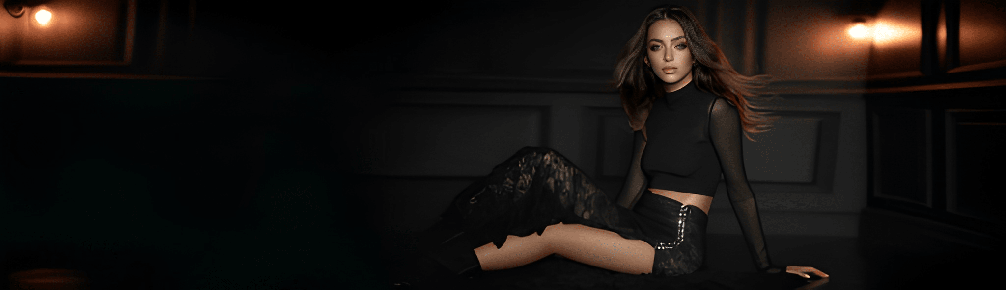
Some rooms hold their breath. This one is dark, paneled, and still. A single amber lamp burns at the edge of the frame, and Sivelle stands inside it as though the shadows were a courtesy extended to her alone.
She does not announce herself. She arrives
I’ve been thinking a lot about “loud” work lately.
Not loud as in colors that scream. More like work that insists on being understood immediately. The kind that hands you the point in the first five seconds, underlines it twice, then adds a caption just in case you missed it.
And I get why. Attention is expensive now. Everyone’s busy. Nobody wants to decode.
But still. There’s this other kind of strength I keep coming back to. The kind that doesn’t chase you down the hallway. It just sits there, composed, and somehow you feel it anyway.
Quiet power.
It shows up in the simplest places. A room with one chair pulled slightly away from the wall. A photograph where the brightest thing is not the subject. A painting that looks almost blank until you notice the surface has been worked like weather.
Texture. Contrast. Restraint. A kind of calm confidence. Not empty. Not timid. Just… intentional.
So this is me trying to pin that down. Not in a clinical way. More like walking around the idea, circling it, touching the edges. A study, basically.
Texture is never just decoration
Texture is one of those things people feel before they can name it.
You don’t always consciously register it, but your body does. Your eyes slow down. You start scanning. You lean in. It asks you to spend time. And time is the real currency here.
A smooth surface is fast. It’s efficient. There’s nothing to catch on.
A textured surface has friction. It interrupts the glide. It says, hang on, look at this part too.
In art, that could be paint laid thick enough to cast a shadow. Or the opposite, a dry brush dragged across canvas so the weave shows through, like the painting is half built from air. In design, it might be a paper stock that isn’t trying to feel like glass. Something toothy. Honest. In architecture, it’s the difference between polished stone and stone that still looks like it remembers the quarry.
And in writing, honestly, texture is rhythm. It’s sentence length. It’s the pause that’s not quite a pause. It’s letting a line land without rushing to explain it.
Texture gives work a second voice.
One voice says what the thing is. The other voice says how it has lived.
And when the second voice is missing, everything can feel oddly disposable. Like it was printed and shipped and forgotten in one motion.
Contrast does not have to be dramatic to be strong
People hear “contrast” and think black and white. High drama. Sharp edges. Before and after.
But some of the most compelling contrast is barely there.
A warm grey next to a cool grey. A matte surface beside a satin one. A long quiet stretch broken by one small, bright note.
Contrast is basically relationship. It’s the way one element makes another element more legible.
And the thing is, contrast isn’t always visual. It’s also emotional.
A moment of softness in a hard story. A joke told in a tense room. A blank wall that makes you notice the one crooked nail.
Quiet power loves subtle contrast, because subtle contrast requires trust. It assumes the viewer is paying attention. Or at least, it assumes they might pay attention if you don’t overwhelm them.
There’s also a little bit of courage in it. Because subtle contrast can look like nothing, if you do it badly. It can look accidental. Underdesigned. Like you didn’t finish.
So you have to commit. You have to know exactly what you’re doing, even if you’re doing it softly.
That’s the weird paradox. Quiet work often takes more control.
Quiet power is not minimalism, exactly
This is where people get tangled up.
They see something restrained and call it minimal. Sometimes it is. Sometimes it’s just quiet.
Minimalism, at its worst, can turn into a personality. A uniform. A refusal. It can get a little smug. Like it’s saying, I’m above mess, above emotion, above the human need to collect things and touch things and keep souvenirs.
Quiet power isn’t about removing life. It’s about arranging it.
It can include mess, but it’s curated mess. It can include color, but color that knows where to stop. It can include ornament, but ornament that feels earned.
Think of a leather chair with scratches in the arms. That’s texture plus time. Or an old ceramic bowl that isn’t perfectly symmetrical, but somehow the imbalance is the point.
Quiet power allows evidence. It allows wear. It allows human hands.
It’s less “look how clean this is” and more “look how considered this is.”
And yes, sometimes those look similar. But they feel different.
The tension between control and softness
The strongest quiet work usually carries tension. If it’s too controlled, it becomes sterile. If it’s too soft, it becomes vague.
That balance is hard. And you can feel when someone nails it.
There’s a Japanese concept, shibui, often described as a kind of understated beauty. Not plain. Not flashy. Something that reveals itself slowly. It’s modest, but it isn’t meek. There’s backbone in it.
That backbone matters.
Quiet power needs structure. A frame. A set of decisions. Otherwise it’s just quiet because nothing is happening.
So when I say “quiet, ” I don’t mean passive. I mean contained.
Like a person who doesn’t raise their voice, but everyone listens anyway.
What texture does to light, and why that matters
Light is the real editor of texture.
Texture is how light becomes visible.
On a flat glossy surface, light is a clean reflection. It behaves like a mirror. It’s easy. Predictable.
On a textured surface, light breaks up. It catches. It scatters. It creates a map of tiny shadows and highlights. Suddenly the surface has depth, even if it’s technically thin.
That’s why textured work often photographs poorly. Cameras tend to flatten. They miss the micro shadows. Or they exaggerate them. In person, you get the full range. You can move your head and watch it change.
And that movement matters because it makes the viewer part of the piece. You’re not just receiving an image. You’re interacting with it.
Quiet power loves interaction. It doesn’t perform for you. It waits for you to arrive.
In interiors, this is why plaster walls feel different from painted drywall, even in the same color. Plaster has life in it. It holds light unevenly. It makes the air feel softer. Suddenly the room feels quieter, even if nobody has said a word.
So texture isn’t just touch. It’s atmosphere.
Contrast as a way of directing attention
Here’s a simple truth: your eye goes where the difference is.
Difference in value. Difference in color. Difference in scale. Difference in sharpness. Difference in density.
In a composition, contrast is like a gentle hand on your shoulder. It turns you. It points.
But the interesting thing is, quiet work often directs attention without feeling like direction. It’s not a neon arrow. It’s a subtle arrangement. Like the way a museum space will put a bench slightly off center so your body naturally faces the painting they want you to notice.
That’s not accidental. That’s choreography.
In a photograph, quiet power might look like a face half in shadow, with one small highlight on the cheekbone. Not because the photographer wanted to hide the subject. Because they wanted you to look longer. To look differently. To notice shape, not just identity.
In typography, it’s the decision to let the headline breathe, to resist the urge to bold everything, to use whitespace like it costs money. The contrast is between presence and absence, which is a weird phrase, but you know what I mean. The text is the text. The space around it is the tone.
And tone is half the experience.
The role of restraint, and the bravery in not filling the space
Restraint sounds like a limitation, but most of the time it’s an act of confidence.
It’s saying, this is enough.
And that’s hard because we’re trained to prove ourselves by adding. More detail. More features. More explanation. More decoration. More evidence.
But quiet power is willing to leave things unresolved. Not unclear, there’s a difference. Unresolved as in, it leaves a little room for you.
A room without room in it is exhausting.
The work that hits me the deepest often has breathing space built in. A sentence that ends early. A doorway that frames emptiness. A song that pauses before the chorus and lets the silence do some of the emotional lifting.
Silence is texture too, in a way. It’s negative texture. The shape of what isn’t there.
When you use contrast well, it feels like control. It feels like taste. It feels like someone who knows exactly what they can get away with.
Quiet power in materials, not just visuals
Sometimes quiet power has nothing to do with what you see. It’s what the object is made of, and how it behaves over time.
A cheap laminate table might look fine on day one. But it doesn’t age. It just degrades. It peels. It chips. It looks worse, not more interesting.
Wood, stone, leather, metal, clay. These materials don’t just last. They change in a way that can add character.
That’s quiet power. Durability without bragging.
And there’s something psychologically calming about it. You feel it in a room with real materials. The space feels grounded. Less like a showroom. More like a place where life can happen and nothing will fall apart if you set a cup down too hard.
That sense of permission matters.
Quiet power often includes an invitation. Not a demand.
Why we crave it right now
I think part of why texture and quiet contrast feel so satisfying lately is because so much of our world is smooth.
Smooth screens. Smooth gradients. Smooth user interfaces. Smooth messaging. Even our opinions are supposed to be smooth. Packaged. Shareable. Instantly understood.
But humans aren’t smooth. Real life has grain.
It has awkward transitions. It has uneven pacing. It has corners. It has moments that don’t resolve until much later, if at all.
Texture reminds you of that. And it’s a relief.
Same with quiet power. It’s a counterweight to constant performance. It’s what you feel when something is solid enough that it doesn’t need to sell itself to you every second.
And maybe that’s the deeper contrast here: not dark vs light, but noise vs presence.
This contrast extends beyond just aesthetics or materiality; it seeps into our very interactions and experiences in the world around us, influencing how we perceive and engage with our environment on multiple levels.
How to build quiet power, without turning it into a formula
This part is tricky because the second you try to systematize quiet power, it starts to evaporate. It becomes a style you can buy. A preset.
Still, there are a few questions I come back to when I’m trying to make something feel calm but strong.
What is the one thing that needs to be noticed first?
If everything is emphasized, nothing is.
Where can I add friction?
Not confusion. Friction. A place for the eye to pause. A surface that holds light. A sentence that makes you reread it once.
What can I remove without the work collapsing?
This is a brutal question. And useful.
Does the piece have a backbone?
Some hidden structure that holds it up. Grid, composition, hierarchy, rhythm, proportions. Whatever the medium is.
Is the contrast doing work, or just showing off?
Contrast for attention is different from contrast for meaning.
Would this still be interesting in a quiet room?
If the answer is no, it might be relying on volume.
And none of this is about being austere. It’s about being deliberate.
A final note, kind of personal
I used to equate power with obviousness.
If it wasn’t clear right away, I thought it wasn’t strong. If it didn’t stand out instantly, I assumed it was failing.
Now I’m not so sure.
Some things stand out because they’re yelling. Some things stand out because they’re steady.
A textured wall. A dark doorway. A single bright ceramic cup on a plain table. A sentence that ends and leaves you sitting there for a second.
That’s the stuff that stays with me.
Not because it demanded my attention. Because it earned it.
That’s what this whole study comes down to, really. Texture that rewards looking. Contrast that guides without shouting. And quiet power that feels less like a pose, more like a presence.
FAQs (Frequently Asked Questions)
What does 'quiet power' mean in the context of design and art?
Quiet power refers to a composed, intentional strength in work that doesn’t demand immediate attention but still profoundly impacts the viewer. It’s characterized by subtlety, texture, contrast, and restraint—offering a calm confidence rather than loud or flashy elements.
How does texture contribute to the perception of artwork or design?
Texture adds a tactile dimension that viewers feel before consciously recognizing it. It slows down the eye, invites closer inspection, and creates friction that encourages spending time with the piece. Texture acts as a second voice, conveying how the work has lived and adding depth beyond its surface appearance.
Can contrast be effective without being dramatic or high-contrast?
Yes, contrast doesn’t have to be stark or black-and-white to be powerful. Subtle contrasts—like warm grey against cool grey or matte beside satin—create relationships that enhance legibility and emotional resonance. Such nuanced contrast requires trust in the viewer’s attention and reflects quiet power through delicate balance.
How is 'quiet power' different from minimalism?
While minimalism often involves removing elements to achieve simplicity, quiet power is about thoughtful arrangement rather than elimination. It embraces curated mess, earned ornamentation, and evidence of life like wear or human touch. Quiet power feels considered and intentional without necessarily being stark or overly clean.
What is the tension between control and softness in creating quiet work?
Effective quiet work balances structure with subtlety; too much control can feel sterile, while too much softness can seem vague. This tension creates depth and interest, embodying concepts like the Japanese idea of shibui, which values understated beauty that reveals itself slowly with backbone and modesty.
Why is light important in revealing texture in design and art?
Light acts as an editor for texture by making it visible. On flat glossy surfaces, light reflects cleanly; on textured surfaces, it interacts with shadows and variations, highlighting depth and detail. This interplay helps convey the materiality and lived experience embedded in the work.


Cassidy — Golden Hour Doesn’t Ask Permission

Loretta Doesn’t Pose. She Stands.

The Muse Decides

THE COPPERVOID™ MANIFESTO: SYSTEM TECHNICAL DOCUMENTATION
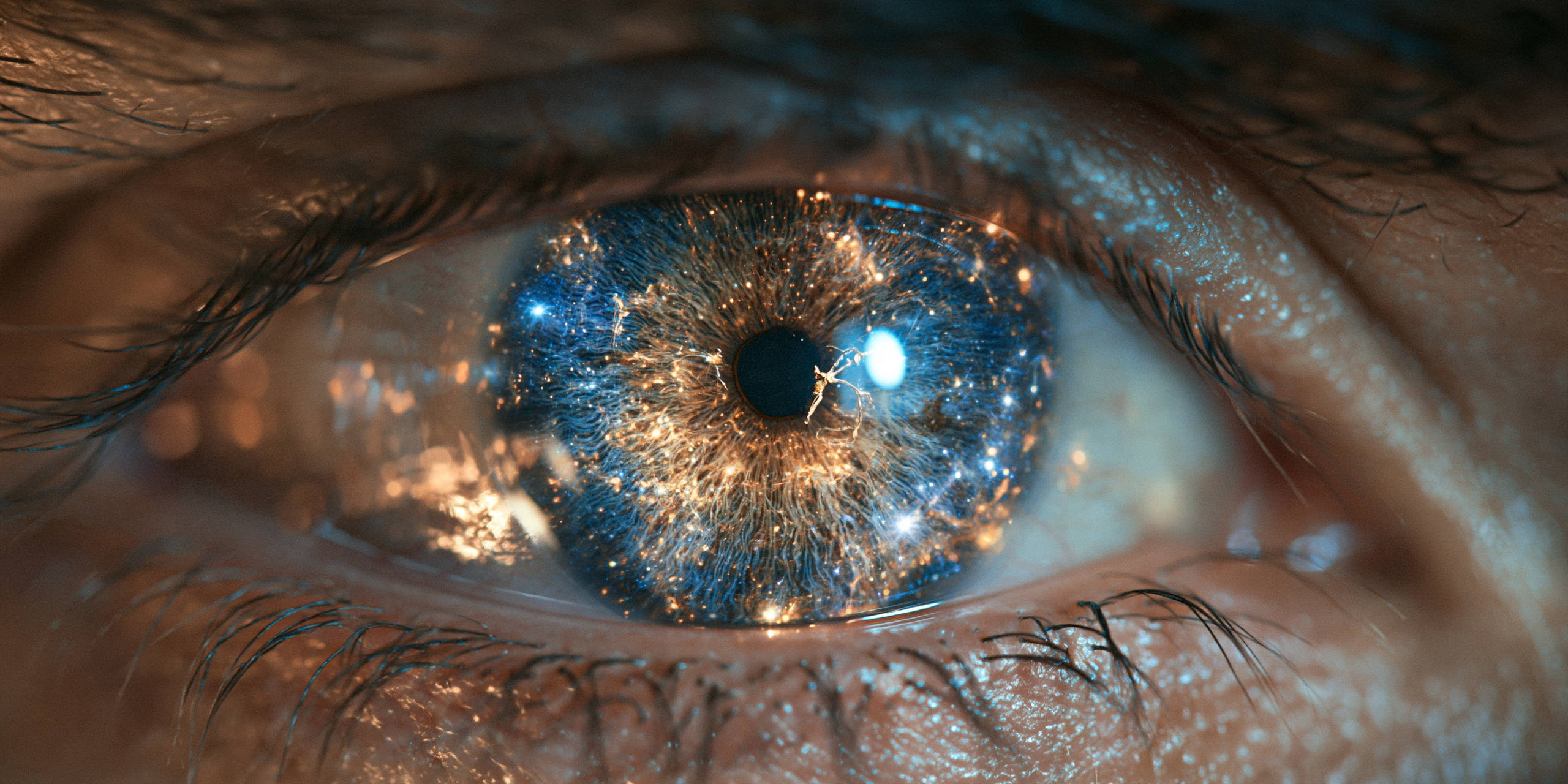
Part I: The Genesis of Intent — Seeing Before Generating

THE UNTAMED HORIZON: WILLA IN THE TEXAS HILLS
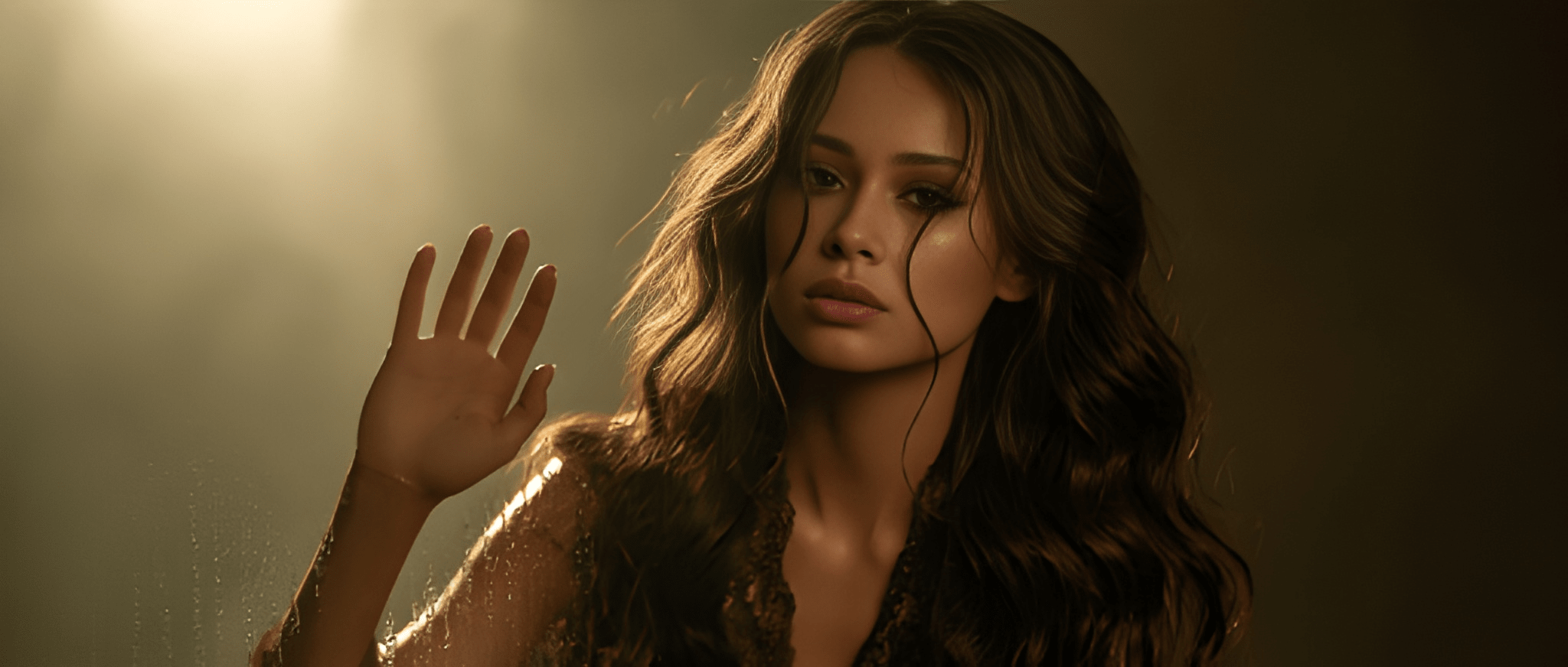
Master Class: Fine Art Lighting and Textured Portraits — The Making of Mae

Blog Post: The Ultimate AI Art Prompt — Craft a Museum-Grade Masterpiece in One Click
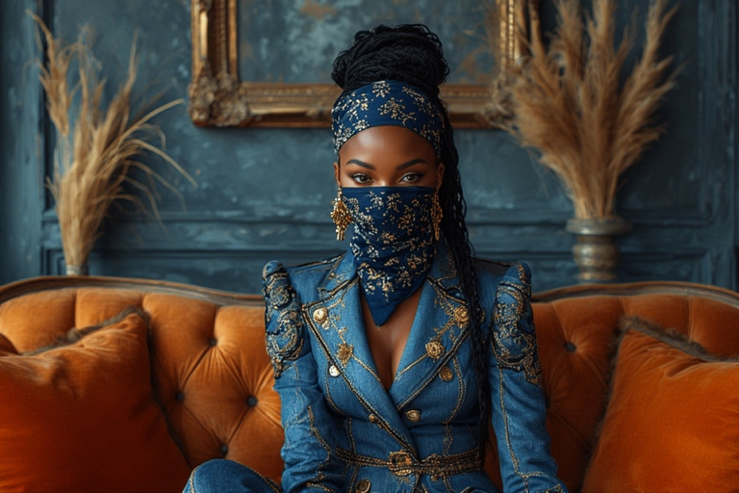
The Controlled Chaos of Creation: On Prompting, Privacy, and the Pursuit of Precision

Shadows of Silk and Thorns: A Dark Fairy Queen’s Ethereal Realm

The Art of Ethereal Realism: A Black Porcelain Feminine Figure with Soul-Piercing Beauty

The Rubedo Cipher Rite

Coded Cipher XO

The Muse: Cipher Draft No. 1